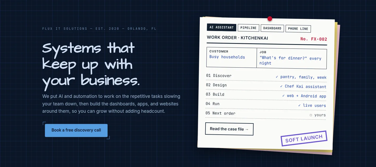
On November 5 we relaunched fluxitsolutions.net. We held it to the same standard as client work: we planned it, tested it, measured it, and checked it end to end before calling it done.
Lead with the work, not the portfolio
The old site opened with a list of our projects. That made sense to us, but a visitor who had never heard of KitchenKai or FirstFile had no reason to care. So we flipped it. The home page now opens with six services, AI and automation first, and each one spells out what you get, who it is for, and a button to ask about that service.
The projects did not go away. They became proof. Each one is now a case file that maps the build to the services behind it, so "we build AI assistants" links straight to an assistant we built and run.
OLD HOME
- KitchenKai
- FirstFile
- NazTrack
- …more projects
NEW HOME
- 01 AI integration
- 02 Workflow automation
- 03 Dashboards & reporting
- …each backed by a case file
A look that says "designed and built"
We kept the blueprint grid and hand-drawn headings, and added a second idea: carbon-copy work orders, like the paperwork on a real job. The pinned work order on the home page flips through four real jobs: an AI assistant, a data pipeline, a reporting dashboard, and a phone line that never misses a lead.
We got the balance wrong twice before we got it right. Paper on every card looked like a costume. Paper on almost nothing lost the idea. The final version puts paper only where a real document belongs: the work order, the case file header, the sticky notes, and the forms.
Accessibility is part of done
Before launch we ran a full design and accessibility audit. It flagged 237 issues across six pages: text too small to read comfortably, footer text with almost no contrast, and headings that skipped levels, which confuses screen readers. We set a minimum text size, fixed the contrast, and repaired the heading order. That got the count to 49, and what is left are minor style notes, not barriers.
Forms that respect people
The contact form asks for consent the right way. Agreeing to text messages is its own checkbox, unchecked by default, and we record when and how you agreed. The privacy page now says in plain words what our analytics collects and what the site's AI assistant does with a chat.
We also removed something. The old Framework page had a testimonial that was never from a real client. It is gone. A real one goes up only when a real client says yes in writing.
AI on a site that sells AI
A company that builds AI assistants should have one on its own site. Every page now has an "Ask Flux AI" button. It always says it is AI and points you to a person when that is what you need. It runs in demo mode today, with answers written from our own site. The live version is next, and we will write about it when it ships.
Checked live, not just locally
"It worked on my machine" does not count as launched.
After the launch we sent a real test lead through the live form, confirmed it arrived with the right tags and consent, checked that analytics counted the visit, and made sure no page scrolled sideways on a phone.
- Test lead arrived
- Consent recorded
- Analytics counted it
- No sideways scroll on phones
What this means for your business
If your website talks about you more than it talks to your customers, it is costing you leads. We build sites that lead with what you do, prove it, meet accessibility standards, and measure what happens after launch. Then we hand you something you can run yourself.